Early usage of graphs in economics
[The existing histories of the usage of graphs in economics miss a number of early specimen. Nevertheless, in the first half of the nineteenth centuries there are more examples than it is acknowledged. This page offers a gallery and references]
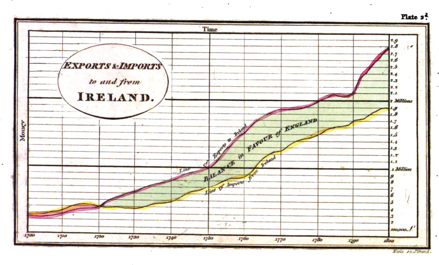
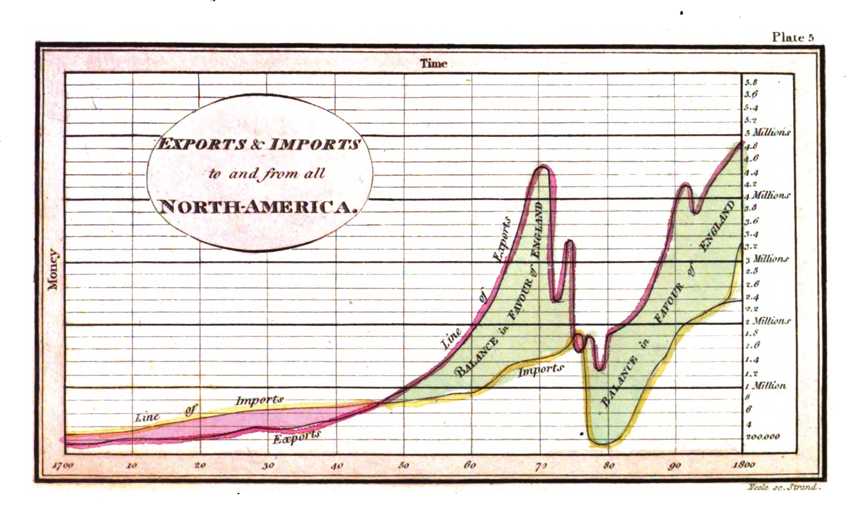
1785: William Playfair
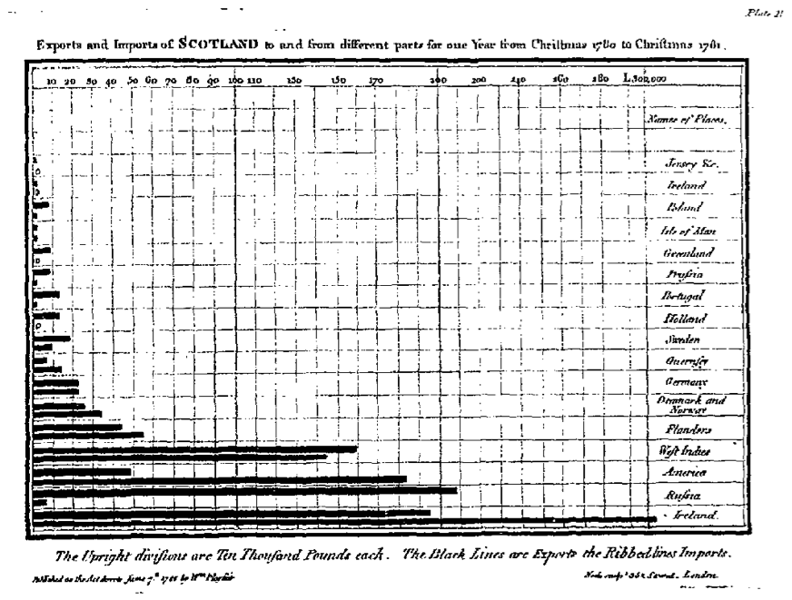
Playfair’s work is well known and is regularly cited as constituting the earliest example of time-series graphs. He applied to finance a method already used in History, Genalogy and Chronology. He argued as follows the rationale of the method:Here are a couple of examples from the first edition of the The commercial and political atlas; representing by means of stained copperplate charts, the exports, imports, and general trade of England, at a single view, published in 1785–86 (sourced from The Making of the Modern World):The advantage propoſed, by this method, is not that of giving a more accurate ſtatement than by figures, but it is to give a more ſimple and permanent idea oſ the gradual progreſs and comparative amounts, at different periods, by preſenting to the eye a figure, the proportions of which correſpond with the amount of the ſums intended to be expreſſed.As the eye is the beſt judge of proportion, being able to eſtimate it with more quickneſs and accuracy than any other of our organs, it follows, that wherever relative quantites are in queſtion, a gradual increaſe or decreaſe of any revenue, receipt, or expenditure, of money, or other value, is tolbe ſtated, this mode of repreſenting it is peculiarly applicable; it gives a ſimple, accurate, and permanent idea, by giving form and ſhape to a number of ſeparate ideas, which are otherwiſe abſtract and unconnected.
Here are some colour examples from the third (1801) edition of The Commercial and Political Atlas, as scanned by Googlebooks.
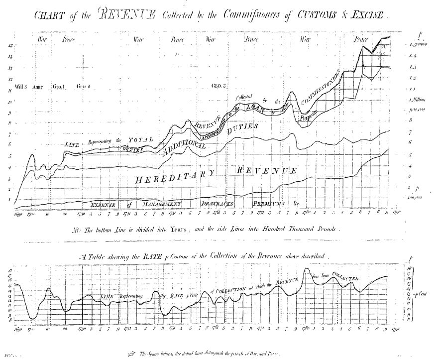
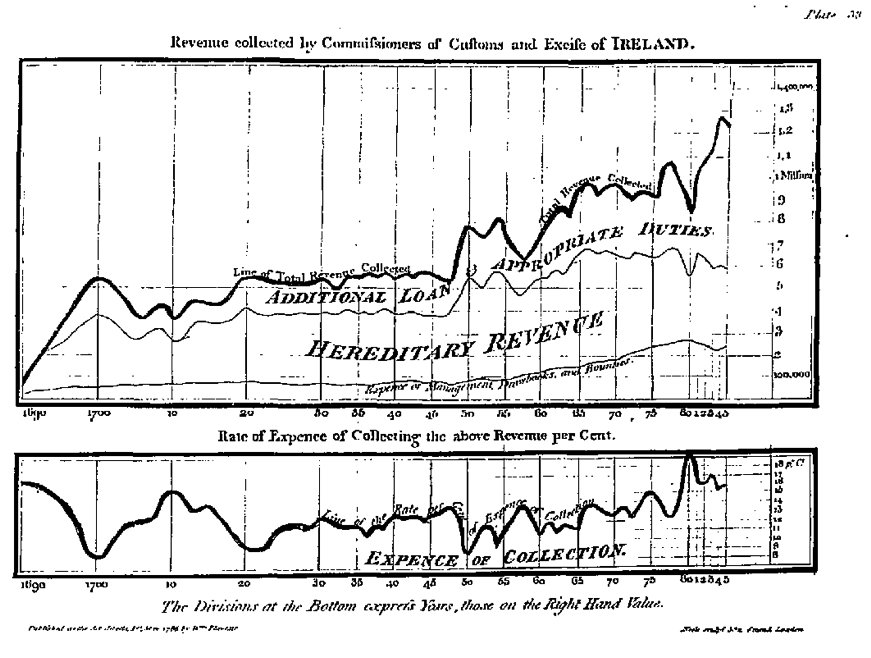
1791: R. V. Clarendon
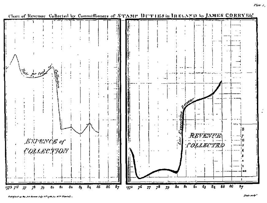
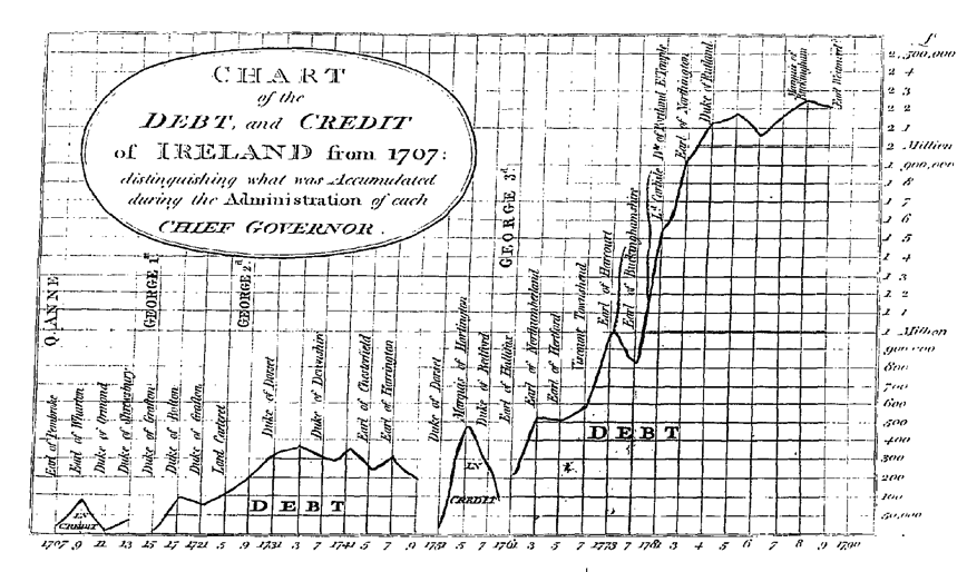
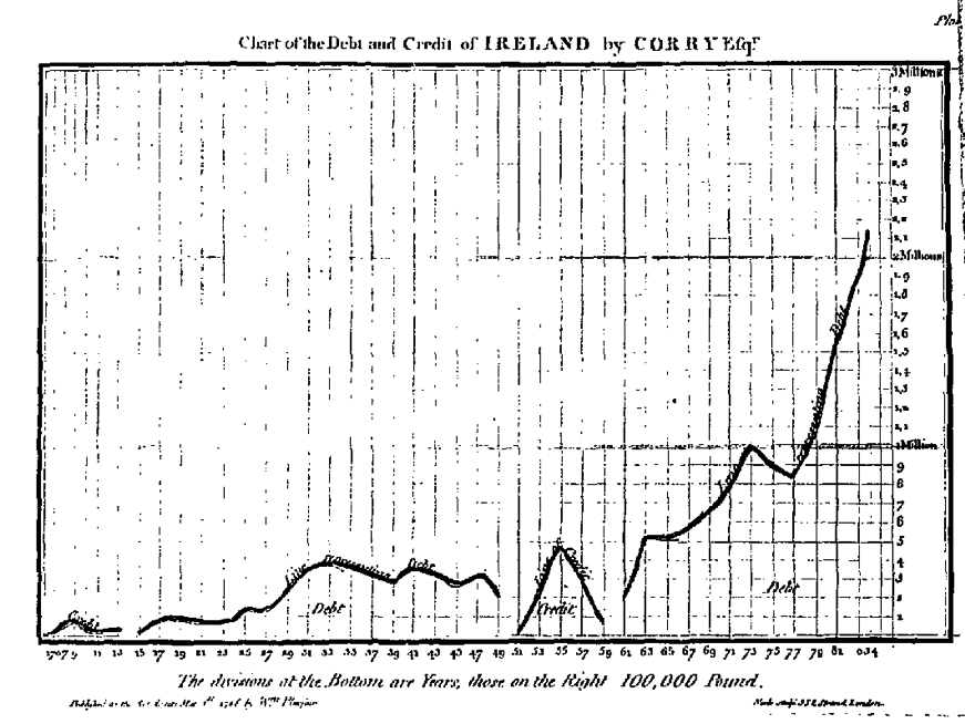
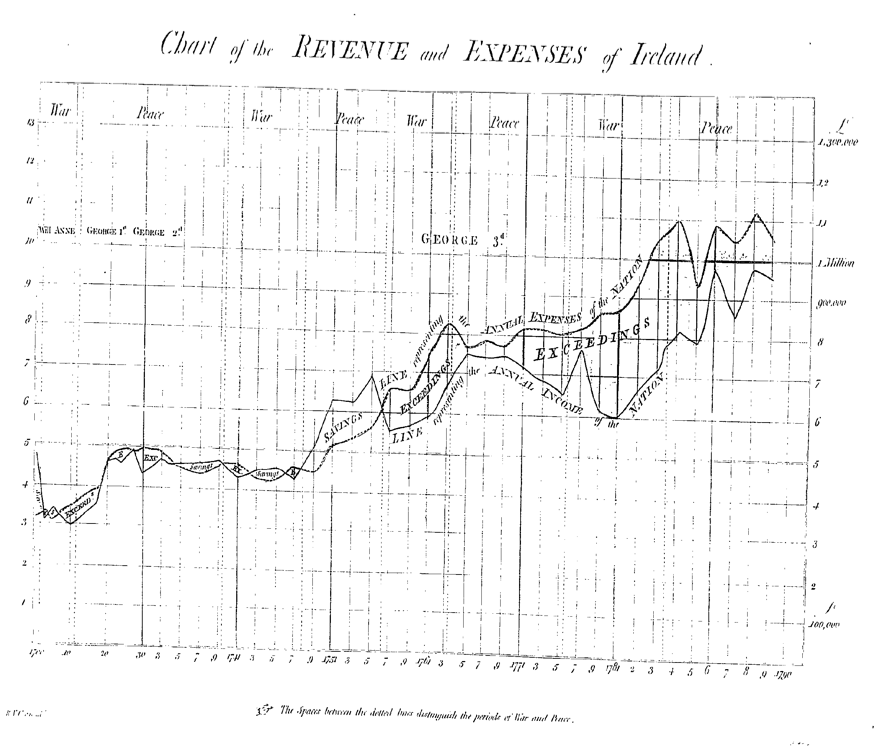
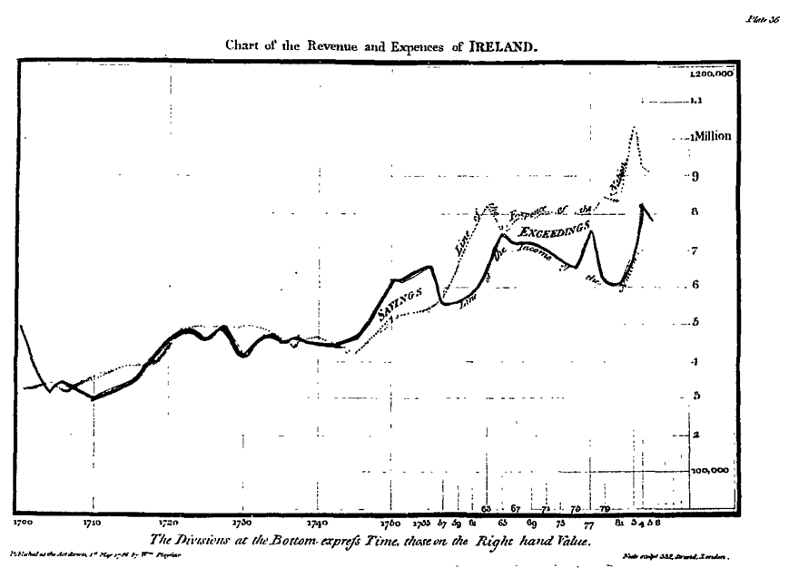
Playfair’s Atlas contained some charts on the revenue of Ireland drawn by James Corry, “done after the manner of Mr. Playfair’s Charts of Trade” (Playfair 1785–86, pp. 147 ff.). Corry’s charts were taken up, updated and refined by R. V. Clarendon in a book titled A sketch of the revenue and finances of Ireland and of the appropriated funds, loans and debt of the nation from their commencement (1791). Clarendon explains as follows the difference:Here are the graphs: Clarendon’s first, followed by Corry’s in Playfair for comparison (all sourced from The Making of the Modern World)Four charts, in a great measure similar to those, were formed, and published by Mr. Corry, a very active, and intelligent Officer of the IrishHouse of Commons—they however only extend to the year 1873. The periods of years were more remote from each other than in these—The Post-Office Revenue was not noticed, the expense of the Stamp collection was not marked, and the Chart of the Debt and Credit is quite different
In the Chart of revenue collected by Customs & Excise, note Clarendon’s addition of the instruction for reading the graph (which in Playfair were expounded in the introductory chapter) and the indication of war and peace years
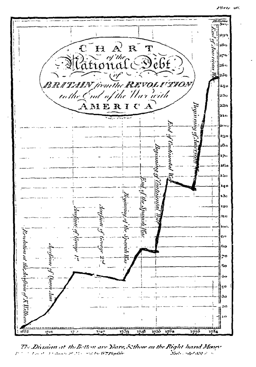
In the Chart representing credit and debt of Ireland,again Clarendon added the name of the monarch and of the Governor in charge during each period:
Similarly for the revenues and expenses of Ireland:
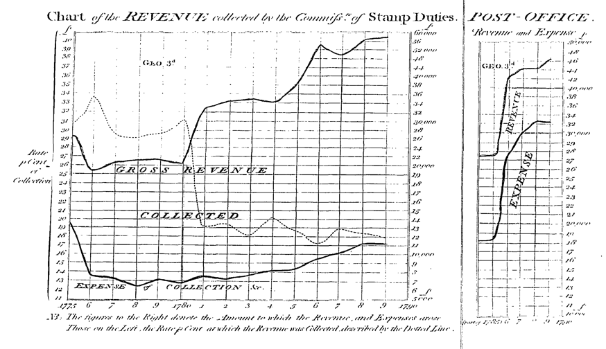
In the Chart of the Revenue collected by the Commissioners of Stamp Duties, note Clarendon’s introduction of different scales on the two vertical axes