Early usage of graphs in economics
[The existing histories of the usage of graphs in economics only record a few early specimen. Nevertheless, in the first half of the nineteenth centuries there are more examples than it is acknowledged. This page offers a gallery and references]
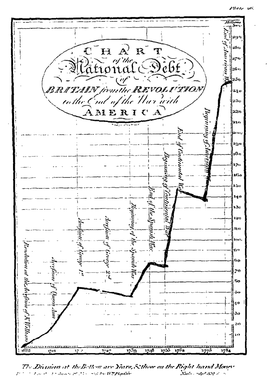
1785: William Playfair
Playfair’s work is well known and is regularly cited as constituting the earliest example of time-series graphs. He applied to finance a method already used in History, Genalogy and Chronology. He argued as follows the rationale of the method:Here are a couple of examples from the first edition of the The commercial and political atlas; representing by means of stained copperplate charts, the exports, imports, and general trade of England, at a single view, published in 1785–86 (sourced from The Making of the Modern World):The advantage propoſed, by this method, is not that of giving a more accurate ſtatement than by figures, but it is to give a more ſimple and permanent idea oſ the gradual progreſs and comparative amounts, at different periods, by preſenting to the eye a figure, the proportions of which correſpond with the amount of the ſums intended to be expreſſed.As the eye is the beſt judge of proportion, being able to eſtimate it with more quickneſs and accuracy than any other of our organs, it follows, that wherever relative quantites are in queſtion, a gradual increaſe or decreaſe of any revenue, receipt, or expenditure, of money, or other value, is tolbe ſtated, this mode of repreſenting it is peculiarly applicable; it gives a ſimple, accurate, and permanent idea, by giving form and ſhape to a number of ſeparate ideas, which are otherwiſe abſtract and unconnected.
Here are some colour examples from the third (1801) edition of The Commercial and Political Atlas, as scanned by Googlebooks.
Playfair produced more diagrams in his subsequent works, e.g. in Lineal arithmetic; applied to shew the progress of the commerce and revenue of England during the present century; which is represented and illustrated by thirty-three copperplate charts. Being an useful companion for the cabinet and counting house (London: printed for the author); An inquiry into the permanent causes of the decline and fall of powerful and wealthy nations, illustrated by four engraved charts. Designed to shew how the prosperity of the British empire may be prolonged (London: Greenland and Norris, 1805); A letter on our agricultural distresses, their causes and remedies : accompanied with tables and copper-plate charts, shewing and comparing the prices of wheat, bread, and labour, from 1565 to 1821. Addressed to the Lords and Commons (London: Printed for W. Sams, 1821).
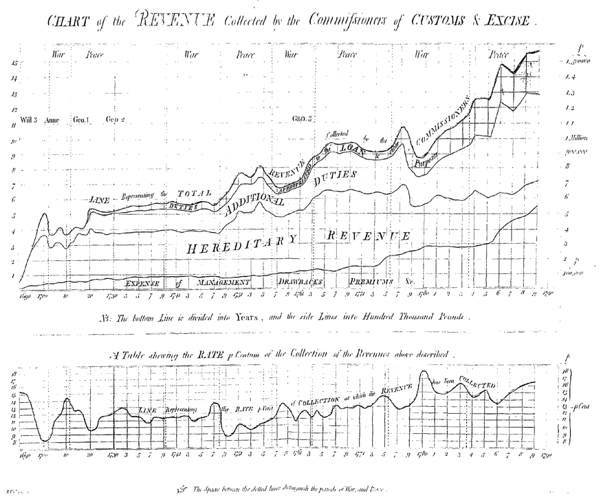
1791: R. V. Clarendon
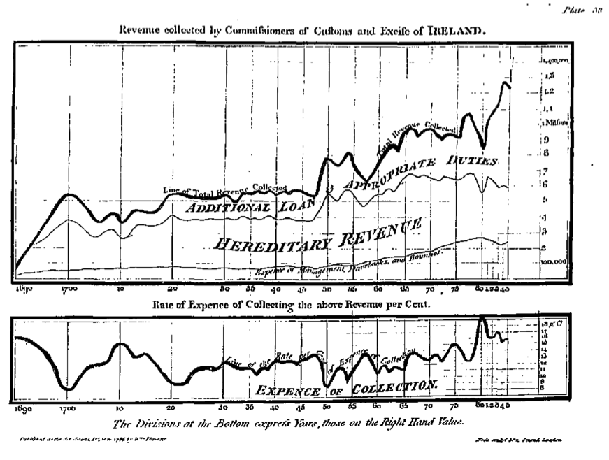
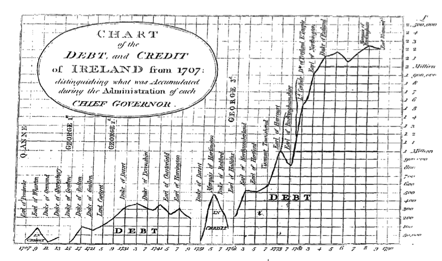
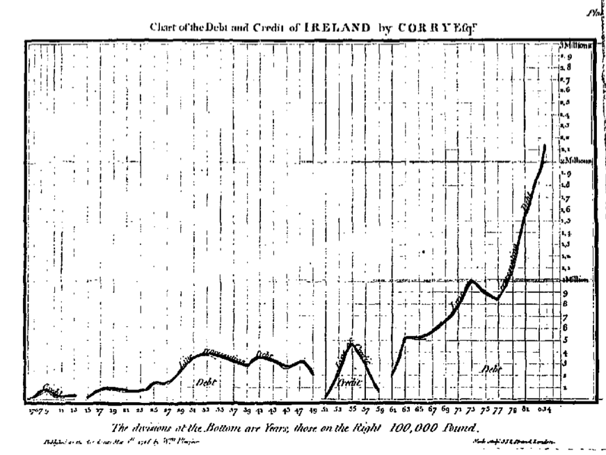
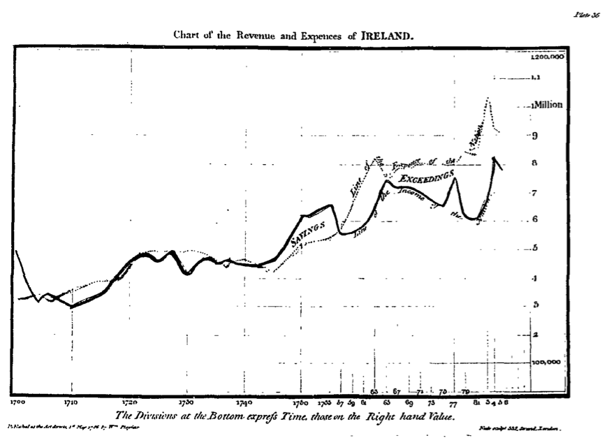
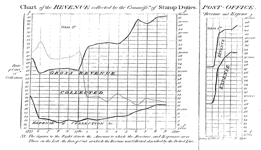
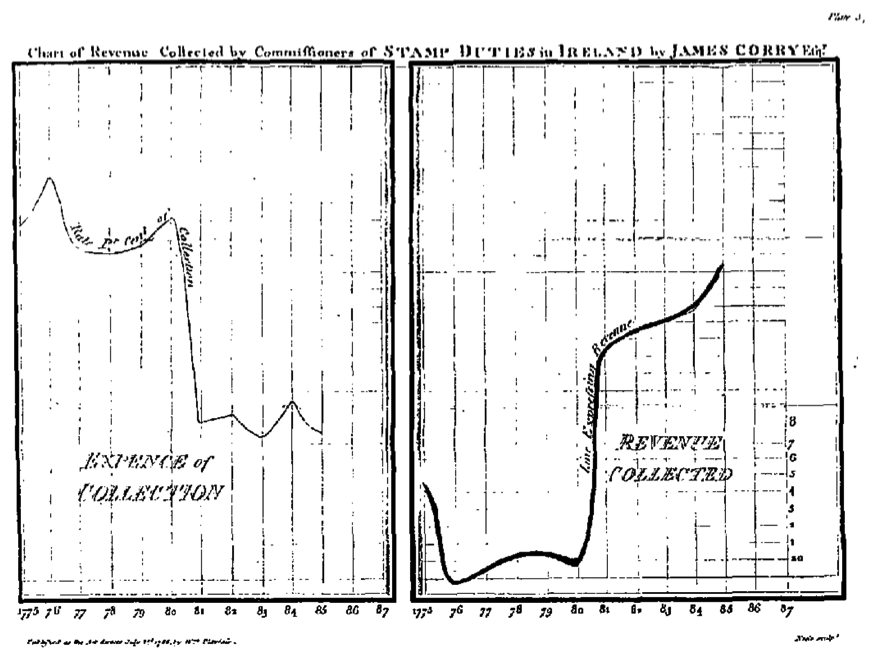
Playfair’s Atlas contained some charts on the revenue of Ireland drawn by James Corry, “done after the manner of Mr. Playfair’s Charts of Trade” (Playfair 1785–86, pp. 147 ff.). Corry’s charts were taken up, updated and refined by R. V. Clarendon in a book titled A sketch of the revenue and finances of Ireland and of the appropriated funds, loans and debt of the nation from their commencement (1791). Clarendon explains as follows the difference:Here are the graphs: Clarendon’s first, followed by Corry’s in Playfair for comparison (all sourced from The Making of the Modern World)Four charts, in a great measure similar to those, were formed, and published by Mr. Corry, a very active, and intelligent Officer of the IrishHouse of Commons—they however only extend to the year 1873. The periods of years were more remote from each other than in these—The Post-Office Revenue was not noticed, the expense of the Stamp collection was not marked, and the Chart of the Debt and Credit is quite different
In the Chart of revenue collected by Customs & Excise, note Clarendon’s addition of the instruction for reading the graph (which in Playfair were expounded in the introductory chapter) and the indication of war and peace years
In the Chart representing credit and debt of Ireland,again Clarendon added the name of the monarch and of the Governor in charge during each period:
Similarly for the revenues and expenses of Ireland:
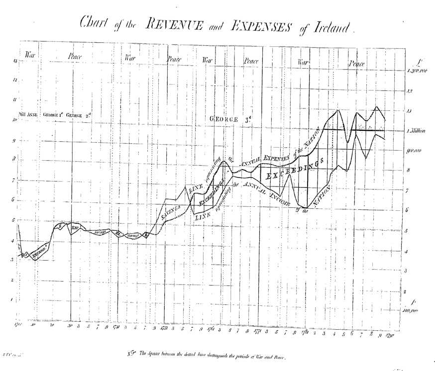
In the Chart of the Revenue collected by the Commissioners of Stamp Duties, note Clarendon’s introduction of different scales on the two vertical axes:
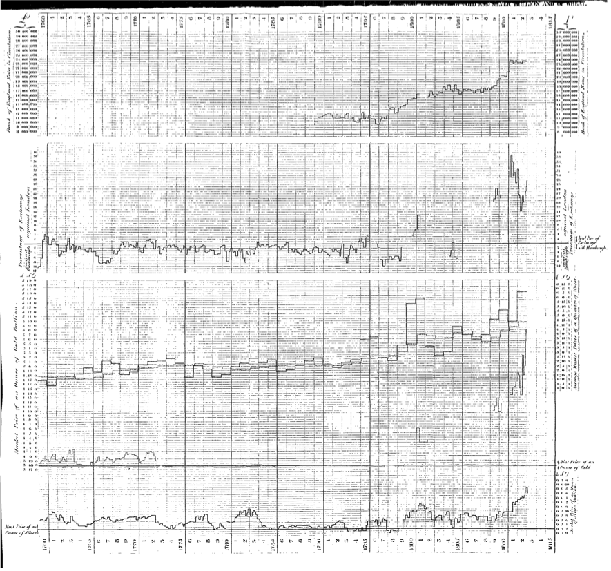
1813: S. Tertius Galton
Shortly after the publication of the Bullion report, Tertius Galton discussed the argument advanced in the Bullion debate by means of a graphical representation of data in a pamphlet titled A chart, exhibiting the relation between the amount of Bank of England notes in circulation, the rate of foreign exchanges, and the prices of gold and silver bullion and of wheat (London: Johnson & Co, 1813). The author’s aim was precisely as stated in the title:
The inference he drew is thatThe intention of the Writer of these pages, in submitting them to the notice of the Public, is to explain the construction of he Chart which accompanies them, and to point out some of the conclusions that may be deduced from the remarkable connexion, which it so obviously exhibits, between the Market prices of Gold and Silver Bullion, the state of our Foreign Exchanges, the price of Wheat, and the amount of Bank of England Notes in circulation. (p. 3)
every great variation, represented by any one line, is accompanied by a variation nearly simultaneous of the others, and in the same direction, though generally different in degree (p. 20n).
He proceded to discuss why the parallelism is not perfect in the minute detailsIt will be perceived that there is a degree of parallelism between the several irregular lines denoting the prices of Gold and Silver Bullion and of Wheat, the rate of the Exchanges, and the amount of Bank of England Notes in circulation, and to such an extent that it is almost impossible to resist the inference that the same cause has operated upon them all. This tendency towards parallelism is particularly observable in those instances where any one of the lines has undergone any great deviation. In such cases, all the rest have been similarly affected (pp. 20–21)
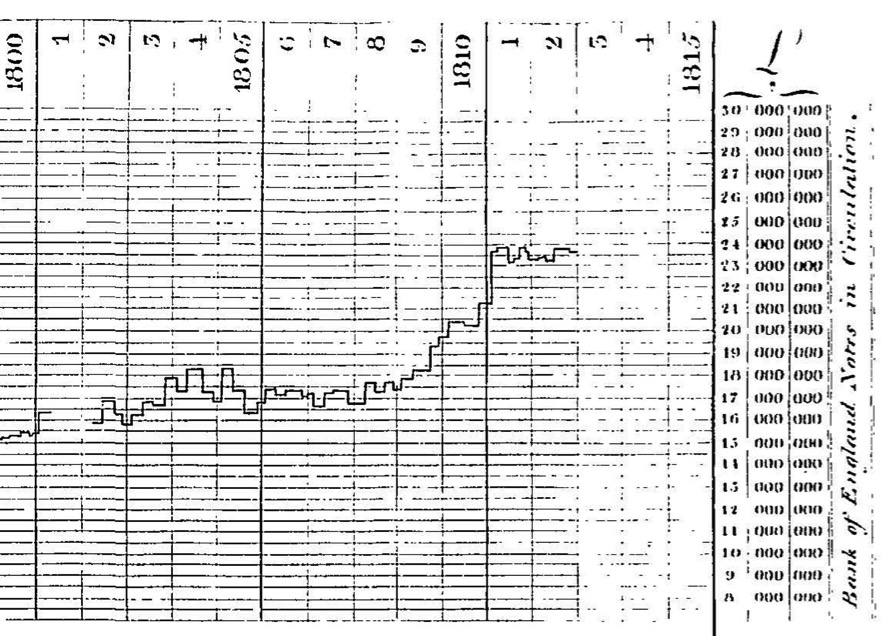
The graph is reproduced as scanned by The Making of the Modern World.
A detail of the previous image:
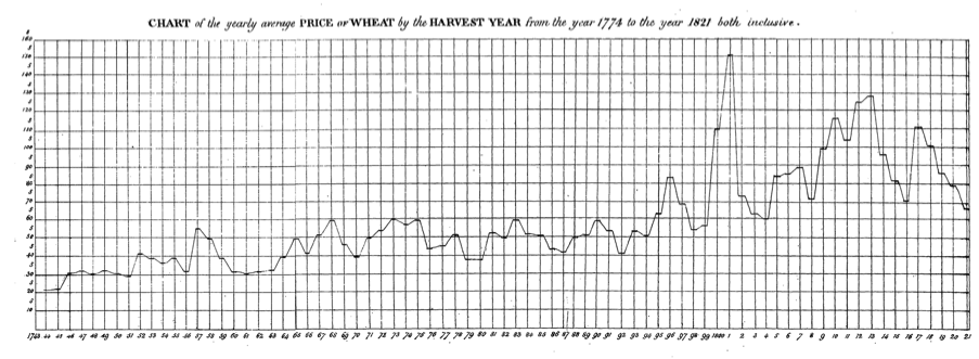
1826: Edward West
In 1826, Edward West illustrated the fluctuations of the price of wheat from 1774 to 1821 by means of a time-series graph, in his Price of Corn and Wages of Labour, with observations upon Dr. Smith’s, Mr. Ricardo’s, and Mr. Malthus’s doctrines upon those subjects and an attempt at an exposition of the fluctuation of the price of corn during the last thirty years (London: John Hatchard and Son). Curiously, when the book was reprinted by Routledge/Thoemmes Press in 1993, the diagram was misplaced and bound together with another essay included in the volume.
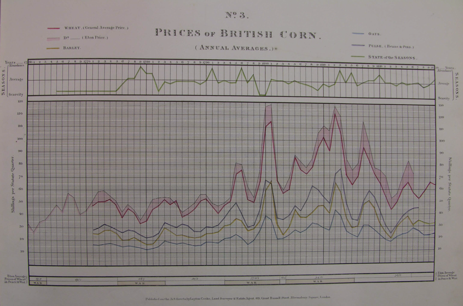
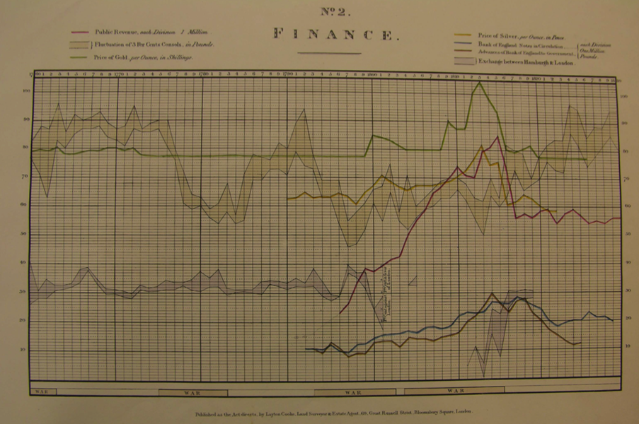
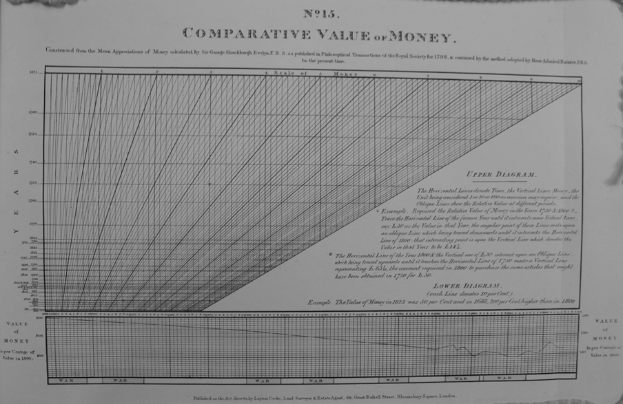
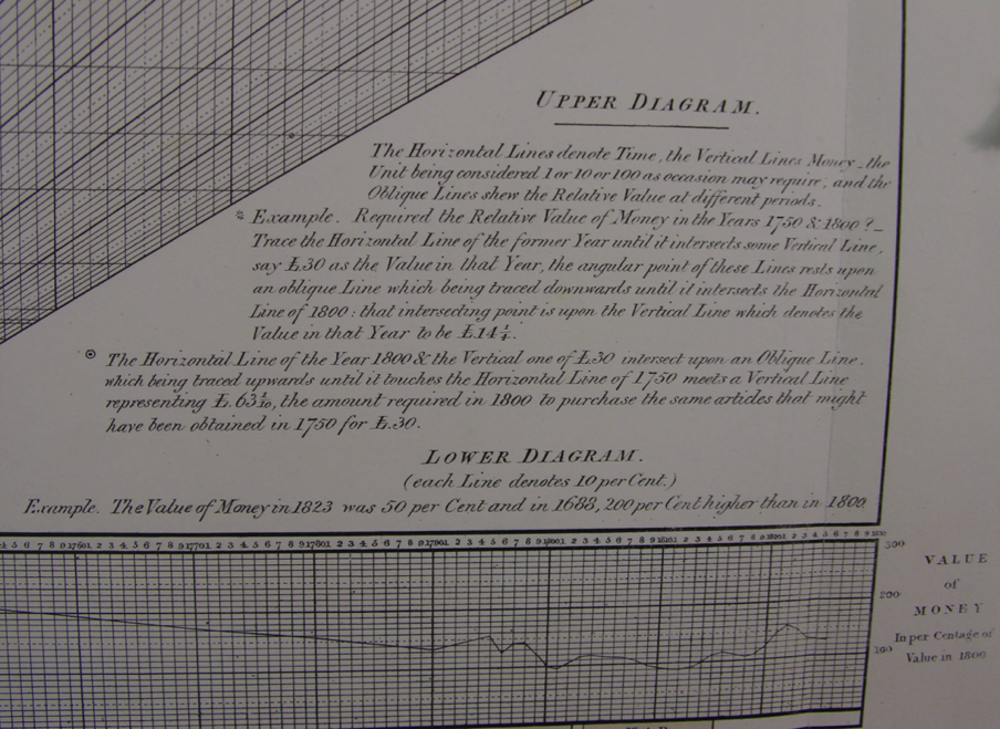
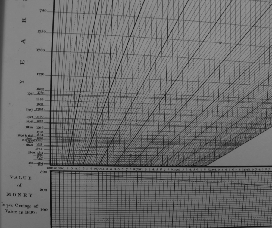
1827: Layton Cooke
In 1827 or 1828, the estate agent and land surveyor Layton Cooke published A Series of Statistical Charts shewing the Fluctuations in Quantity and Value of the Products of the Soil, with various ascertainments obviously influential on the husbandry of the British Empire, founded on official and other authentic documents (published by the author, undated). The large volume (51 x 38 cm)collects 15 charts, finely illustrated, on: national debt; finance; british corn; wheat in Southern and Northern Europe; imports and exports of merchandise and corn; bounties and duties on corn; wool prices and quantities imported and exportd manfactures; Malt, beer and hops; Parochial assessments: wages, population, inclosure bills; prices of various articles of provision; Sundry documents; comparative taxation; provincial statistics; and comparative value of money.
The author explains that
Most charts represent time series, like the two illustrated below (photographs taken from the copy in the LSE archives, one of the two extant specimen; permission to reproduce them is gratefully acknowledged)The following Charts facilitate the arrival at equitable conclusions, without discursive reading or tedious calculation; and being composed of a concentrated delineation of facts, the mind, by transient view, unbiased by obtrusive commentary, is directed to an accurate knowledge of various Subjects of considerable importance.
Graph 15 is instead a graphical calculator
1839: John and Charles Walker
The engravers John and Charles Walker printed in London in 1839 a, 8° Mercantile Chart, exhibiting the fluctuations of the prices of Consols, Exchequer Bills, Foreign Exchanges, and the principal articles of commerce in London, during the last seven years. Only one copy of this single sheet seems to be extant, at the British Library.
Priced 4s, it was advertised in The Athenaeum of 23 February 1839 as having printed on that very day “on one large sheet”, while The Spectator advert described it as follows
A linear price current; the rise and fall of each article being indicated by the corresponding deftections of lines crossing the columns of years divided into months: thus the relative value of the commodity at any period within this time is apparent at a glance (The Spectator, n. 615, 11 April 1840)
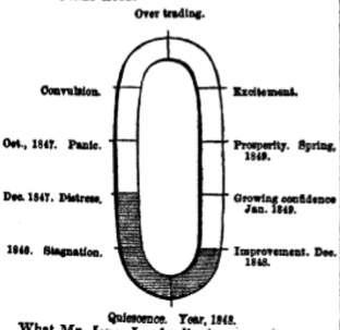
1840: Mountiford Longfield
Three years after Samuels Jones Loyd (later Lord Overstone) famously described trade as revolving “apparently in an established cycle. First we find it in a state of quiescence, – next improvement, – growing confidence, – prosperity, – excitement, – overtrading, – convulsion, – pressure, – stagnation, – distress, – ending again in quiescence” (Reflections suggested by a perusal of Mr. J. Horsley Palmer’s pamphlet on the causes and consequences of the pressure on the money market, 1837, p. 37), Mountiford Longfield represented a similar string of states of trade in a circular arrangement (‘Banking and currency’, Dublin University Magazine 15, 1840, pp. 1–15, 218–33; 16, pp. 371–89, 611–20). Like Overstone’s, Longfield’s cycle is interrupted, the interruption being graphically represented by means of a dot at the bottom of the circle —but at the opposite end of Overstone’s. For a full discussion see D. Besomi, Graphical representations of Overstone’s cycle of trade, in C. Gehrke, N. Salvadori, I. Steedman and R. Sturn (eds), Classical Political Economy and Modern Theory. Essays in Honour of Heinz D. Kurz, London: Routledge, pp. 289-312)
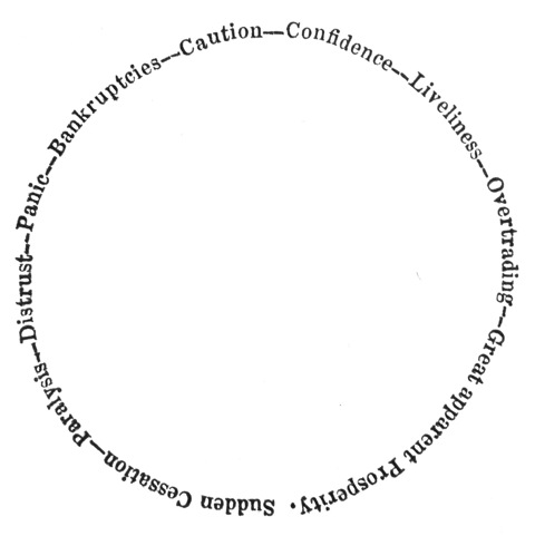
Notably, Longfield’s drawing is conceptual, rather than representing series of data.
1845: J. Jones
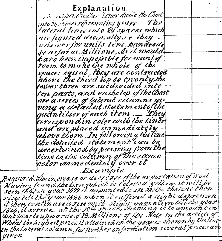
Around 1845, J. Jones compiled A statistical chart shewing the comparative amounts of the revenue expenditure, exports, imports, and land sales of New South Wales [electronic resource] : the quantities of wool, oil, tallow exported, the price of wheat and the increase of the population from 1822 to 1844; it was printed in Sydney )sold by W. Colman & W. Ford) in one single sheet measuring 33 x 41 cm (here reproduced in black and white (the original was in colour) as scanned by Gale’s The Making of the Modern World)
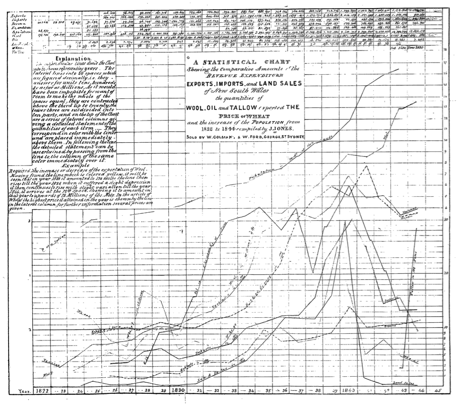
Note that the table with the data is reproduced at the top of the chart, that he felt the need to explain how a graph is constructed and should be read, and that different scales are used for different lines on the same diagram
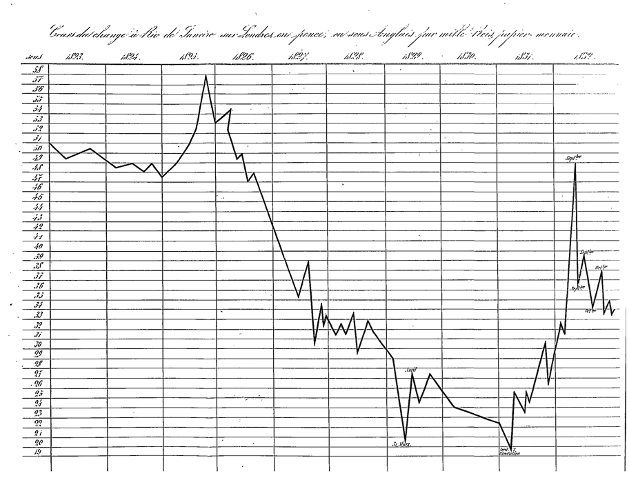
1847, Charles Wilson
A few years later, Charles Wilson inserted in his book Wilson, De l’influence des capitaux anglais sur l’industrie européenne depuis la Révolution de 1688 jusqu’en 1846 (Bruxelles: A la Librairie polytechnique d’A. Decq, 1847) otherwise rich of data in tabular form, a graph representing the exchange rate between Rio de Janeiro and London, 1823–1832, in order to show visually the steep drop of the exchange rate between 1825 and 1827. The graph is reproduced as scanned by Gale’s The Making of the Modern World; the Google version omits the diagram (inserted between pages 72 and 73).
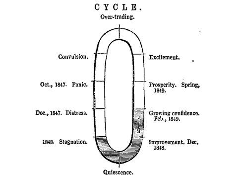
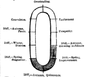
1849: James Harvey
Under the initials J.H. and the pseudonymous of ‘Pactolus’, James Harvey, the secretary of the Liverpool Currency Reform Association, represented graphically Overstone’s cycle of trade. Harvey differed from Overstone’s interpretation of the cycle being inevitable, and argued instead that it was the product of the monetary policy inspired by Overstone himself: the graphical representation was not, therefore, a celebraton of Overstone’s view, but an instrument of criticism (see D. Besomi, Graphical representations of Overstone’s cycle of trade, in C. Gehrke, N. Salvadori, I. Steedman and R. Sturn (eds), Classical Political Economy and Modern Theory. Essays in Honour of Heinz D. Kurz, London: Routledge, pp. 289-312).
Besides representing a modified version of Overstone’s 10 phases in a circular arrangement, similarly to Longfield (see above), Harvey dated the phases of the current cycle, and shaded three of them giving the neat impression of having drawn a barometer —and indeed in one of his texts he explicitly referred to the drawing as a barometer of trade. The diagrams are not only conceptual, but also representing the immediate past and forecasting the future to come.
The fist diagram appeared in a newspaper article —hence the bad quality of the reproduction (The great question for discussion – The currency. Jones Loyd’s cycle of trade, or the effect of gold money, by J. H., Liverpool Mercury, 9 January, issue 2055)
The second diagram was incorporated in a piece included in a pamphlet for the Liverpool Currency Reform Association (‘Jones Loyd’s cycle of trade; or the effects of the gold currency’, in Liverpool Currency Reform Association, Suggestions for a new system of currency by which monetary panics will be rendered impossible: submitted to the trading community of Liverpool, by a committee of gentlemen who believe that the permanent prosperity of the country depends upon a proper settlement of the money question, Liverpool: Lace and Addison, February 1849). Note how the mercury of the barometer had moved towards ‘growing confidence’ within a month of the publication of the first diagram(reproduced from the scan in The Making of the Modern World).
The third diagram was drawn at the end of the same year, again in the same newspaper as the first drawing (‘Jones Loyd cycle again’, by Pactolus, Liverpool Mercury, 18 December, issue 2151). Note how the phase of ‘growing confidence’ must have been slow to come, as the dating was updated with respect to the previous graph:
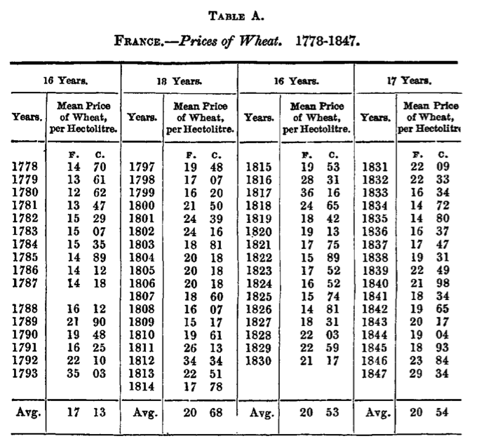
1850, J. T. Danson
In an article “On the Fluctuations of the Annual Supply and Average Price of Corn, in France, During the Last Seventy Years, Considered with Particular Reference to the Political Periods of 1792, 1814, 1830, and 1848” (Journal of the Statistical Society of London, 13: 2, May 1850, pp. 152-167) J. T. Danson translated a table reporting the price of French prices of Wheat 1778–1847 into a graph. The axes do not indicate years on prices; they are divided in four periods, with an horizontal line representing the average price over the period. The graph is unintelligible without the correspnding table. Both are reproduced, using images extracted from the JSTOR version.
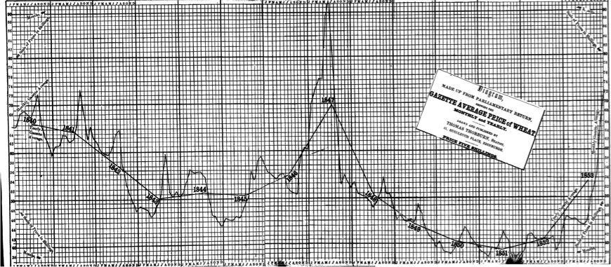
1851–1855: Thomas Thorburn
Between 1851 and 1857 Thomas Thorburn, superintendent of the census of the city of Edinburgh, published numerous books containing diagrams on various subjects: Diagram shewing, in regard to the counties of Scotland, the comparative amount of attendance on public worship, on the part of the various denominations; on 30th March, 1851, in the forenoon (1 folded sheet, Edinburgh 1851); Statistical Analysis of the Census of the City of Edinburgh, 1851; Compiled by Order of the Lord Provost, Magistrates, and Council (Edinburgh: Adam and Charles Black, 1851; 65 p. 22 cm); Thorburn's reference diagrams relative to the counties of Scotland (Edinurgh, [1852], 1 sheet ; fol.); Diagram shewing comparatively the progress of the Population in the counties of England and Wales, during the last 50 years (Edinburgh, [1852?], s. sh. fol); Diagrams railway economics (Edinburgh 1853); Diagrams. Agricultural and other subjects (Edinburgh : T. Thorburn, 1853); Diagrams: mercantile and other subjects, presented in annual progression (Edinburgh, 1853); Diagrams: Corn-Trade, and Other Subjects (Edinburgh: Thomas Thorburn, 1854; 15 diagrams, some folded, 23 cm); Diagrams, Agricultural statistics of Scotland, for 1854 (London: Effingham Wilson, 1855); Diagrams, illustrative of facts, principles, & theories (London: Effingham Wilson, 1855); Diagrams, exhibiting, comparatively, the strength of the various religious denominations, as shewn by the (1) number of churches, (2) number of sittings, (3) attendance, made up from the census returns, 1851, and other relative subjects (Edinburgh : T. Thorburn, 1855; 109 pp. 24 cm); Diagrams, illustrative of facts, principles, & theories, relating to agriculture, annuity, army, banking, &c. &c. (London, 1855); Diagrams, agricultural statistics of Scotland, for 1854, as furnished in the following month of January to the government (London, 1855); and Diagrams illustrative of the area or extent, population, debt, revenue, exports and imports, and the army and mercantile navy of India (Edinburgh, 1857).
Only a few of these books are readily accessible, except in a few libraries worldwide. Googlebooks incorporates copies of two of them (linked above), but all diagrams are broken into two parts and missing the central part. The figures reproduced here are drawn from The Making of the Modern World’s scans of Diagrams: Corn-Trade, and Other Subjects. The diagrams bound together seem to have also been sold separately, and may therefore be found in separate collections.
Thorburn’s diagrams served a multitude of purposes.
The following is particularly interesting: it reports the monthly and yearly average prices of wheat from 1840 to 1853, with monthly prices almost systematically showing a peak during the summer and a descent after the crop, and yearly averages showing a marked undulation
Work in progress ……………